


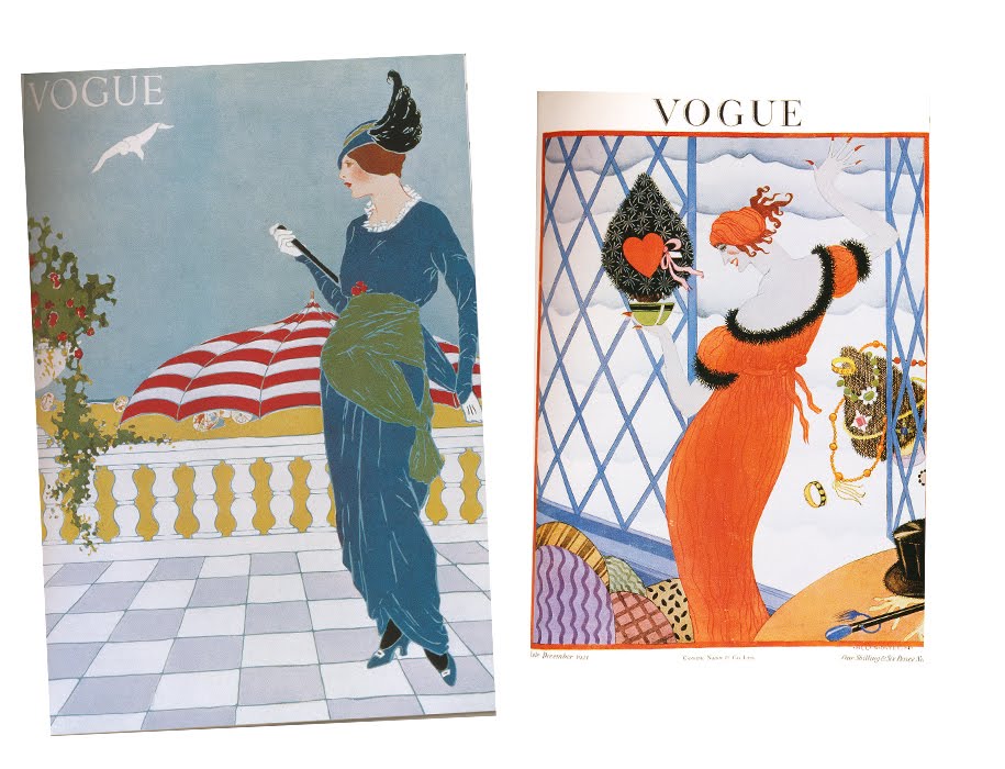
 From top to bottom (left to right): 1933, 1935, 1932, 1933, 1913, 1921.
 Magazine covers used to be so creative. They were so much more interesting than someone posing on the cover. I mean, how many variations can you get of that? I like how it's not anyone particular at all. It lets the cover go in so many more directions. I didn't even realize until recently that these magazines featured artwork on the covers for so many years.
They also seem really modern to me. When I first saw the fourth picture about a year ago, it was intruiging to me that it's from 1933. It seems so innovative! They all seem that way, actually. The last one is pretty out there. I definitely like the two middle ones the most, because of the simplicity/colors/shapes/writing.
Simone


3 comments:
pretty covers, I think they should have covers with art and posing. that would be awesome
I agree with you. That style was fantastic.
You'll probably dig Erté's art if you haven't seen it already.
Link :: http://home.att.net/~star_child/erte2.html
He's actually the artist of all the Harpers Bazaar covers in this post!
Post a Comment